
Modernizing an Enterprise Security Platform
An award-winning app my first foray into software
Product Description: DbProtect is a visual security platform for databases and big data, helping organizations secure their data anywhere. Its agentless Vulnerability Management tool identifies and prioritizes security issues, providing visibility into risks that could lead to data breaches.
My Impact as the Sole Designer
I comprehensively redesigned a B2B SaaS database security web app for enterprise customers transforming it into the acquiring company’s top-selling product and earning industry acclaim.

Pioneering Design in Uncharted Territory
As their first and only designer, I embraced the challenge of leading the redesign of the company's enterprise database security software and educating an engineering-driven team on user-centered design.
New to cybersecurity and software design, I took ownership of user stories, research, strategy, and design—educating the team on user-centered principles and managing a simultaneous redesign of their other product while leading a contract designer. My comprehensive involvement was key to the software's success and my ability to navigate these challenges underlined my capacity to learn rapidly and deliver high-impact outcomes in entirely new environments.


The Problem
The startup was losing customers due to the poor visual design and usability of its primary software offering.
The software has strong capabilities, but suffers from a frustrating user experience and an outdated appearance.
—Potential Customer (lost sale due to poor product)
Poor Visual Design: Dated, generic appearance with overly text-heavy content.
Poor Usability: Inconsistent use of UI elements, horizontal scroll bars, and multiple layers of pop-ups.
Poor Navigation: Poorly organized data, unclear user actions, and difficulty achieving desired results.
Poor UX Writing: Inconsistent and incorrect grammar usage.
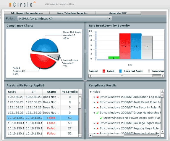
Original software
The Goals
The company aimed to resolve customer attrition by enhancing usability and modernizing the design of its security web app to better meet user expectations and competitive standards.
Business Goals:
Increase Sales Appeal: Redesign the enterprise software to be more attractive to potential buyers.
Product Goals:
Enhance UX & UI: Improve the overall user experience and user interface.
Optimize Scalability: Enhance scalability to reduce development time and streamline future updates.
Improve Performance: Refactor merged product technologies for better performance, scalability, and visual coherence.
Facilitate Content Integration: Enable easy content integration without needing designers or engineers, while maintaining optimal usability.
Strategic Rollouts: Implement changes in small, strategic deployments to avoid downtime.
The Solution
I redesigned the enterprise web application to create a more modern user-friendly, role-tailored interface, improving productivity and streamlining workflows.
To tackle the challenges of the outdated application, I led a comprehensive redesign focused on usability and efficiency. By conducting user research, I identified pain points and crafted an intuitive, modern interface that streamlined workflows. Key improvements included a reorganized information architecture, customizable dashboards tailored to user roles, and advanced search capabilities. Working closely with engineering, I ensured the design was scalable and met business needs. The final product was a more user-friendly application, boosting productivity and significantly enhancing the user experience.
Research Overview
I conducted interviews, on-site visits, competitive research, and in-depth industry study to build a robust reference library and ensure best-in-class practices.
Sample screenshots from competitor products:


Understanding the Product
Through comprehensive hands-on learning and research, I quickly bridged knowledge gaps, becoming an effective and informed team member.
I engaged in product demos, self-study, co-worker interviews, Wiki documentation review, industry jargon research, and high-level flow mapping.
I worked with stakeholders to craft use cases to document the various user roles and their goals and motivations, as well as conceive of possible edge cases.
Addressing the Information Architecture
I proposed rethinking the product’s navigation to align with user roles and goals, leading to the development of a new information architecture in collaboration with stakeholders.
Original navigation below, which correlated to the business offerings and internal product teams.
I worked with stakeholders to develop our ideal IA map, complete with a phased rollout plan. Below is the final IA version we targeted.
Upgrading to a New Code Base
As part of the software updates, we upgraded to a new code base, requiring customers to assist with migrating some of their data.
Collaborating with engineers, I developed a migration diagram to guide customers through the data transfer process during the code base upgrade.
This diagram encompassed the two sister products I was redesigning. View the sister product.
Symbols within the colored lines help those who are color challenged
Mapping User Role Functions
Creating user activity diagrams enabled me to streamline functionality, eliminate redundancy, and guide the engineering team's backend architecture.
I produced diagrams to map each user role’s activities, creating many iterations until the team agreed that they reflected the current functionality and new feature requests.
Sample diagrams below for the role of managing jobs.
Iterative Design Exploration
I collaborated closely with stakeholders, refining initial sketches through discussions and iterations before advancing to wireframes and executing selected designs in phased releases.
Some of my sketches to explore my ideas.


The next phase involved wireframing the sketches with the most potential. This process involved many iterations and selected designs were executed over various shipping phases.
Below is a sample from a faceted search. I considered going with a model where the content refreshes every time a box is checked like on Amazon or Zappos, but went away from that for three reasons:
Our users weren’t browsing to shop - they knew what they were looking for and wanted to view a specific set of data based on a unique combination of filter options.
Our users wanted to save their search queries for future use.
It was taxing the backend performance to refresh after every click.
Based on the above direction, I designed a solution to alert users when they were viewing stale data.
Another example from this project is the navigation menu I organized based on user role functions. I explored adding icons next to the tab names, but decided they created unnecessary visual noise when viewed in context with the full page.
In the end, I color-coded the user role sections based on feedback, making it easier for users with multiple roles to quickly differentiate between them.
Strategic Improvements Despite Technical Constraints
The new software framework had limited customization options, and with limited development resources, the team aimed to save time and ship updates quickly.
As a result, developers were reluctant to override default widgets, leaving me to focus on theme color changes and strategic customizations.
Addressing the Inconsistent Icons:
The existing icons lacked consistency and professionalism, and weren't effectively being used to reduce text overload. I proposed adding relevant icons and found a font set that met most needs, minimizing custom icon creation. Later, I collaborated with a contractor to update the icon set for our sister product.
Improving Analytics & Reports:
The existing chart colors were inconsistent across asset types, making it hard for users to identify them. To improve recognition, I created a consistent color palette for each asset type and version, and replaced written names with icons with tooltip names.
Original dashboard
Redesigned dashboard
Original report
Redesigned reports - introduction of reports based on user roles such as this Executive Report
Helping Users Onboard
To help users onboard, I created user guides and unique wizards to guide each provisioned user role.
Original installer graphic
Redesigned installer graphic
Original login - unauthorized image they had grabbed from the internet, non-clickable URL strings
Redesigned login - space for system notifications, clickable URLs, emphasized login button
Based on user role and permissions, users would see either some or all top menu sections in the web app. Below is the entry point for users provisioned with the asset manager role.
More sample redesigned pages for the web app.
Original job landing
Redesigned job landing
Original report library
Redesigned report library
Implementation
I worked closely with the engineers throughout the design process to ensure my designs were implementable with our widgets and backend services.
I created detailed specs to aid the front-end developer in creating CSS stylesheets.
User Testing & Accessibility
I collected feedback from key customers and checked the product for accessibility.
I conducted webinars with customers to observe them using our product, and recommended product updates, after evaluating common feedback themes.
Screenshare from customer testing
To ensure inclusivity, I tested it using accessibility tools like NVDA and JAWS screen readers, as well as the WAVE Report.
Deuternaopia color blindness view
Screen reader view
The Final Impact
The evolved software product became one of the best sellers at the acquiring company and continues to win awards.
The product received a very high Net Emotional Footprint (NEF) of +94 and its usability and intuitiveness ranked above average in the industry. View awards article.
“Provides automation functionality and ease of use - an everyday staff member in the IT unit can use this service without having to be an expert in DB management.”
- Security Consultant at a Financial Services Firm

Updating the Interface
I’ve since gone back and updated the app with a more modern interface.
Where to next?