
Helping Merchants List Products Faster to Accelerate Sales🚀
Overview
I revolutionized the user experience for online resellers and brands, enabling them to list products faster and more accurately across multiple sales channels. This effort reduced offer listing time by 90% and minimized publishing errors by 80%.
My Role:
Sole designer and researcher
18-person startup
Led end-to-end with PM, Dev, CX, Sales
User research and usability testing
Iterative prototyping
The Catalyst for Change
As part of our acquisition strategy, stakeholders aimed to boost user engagement and conversions with a free trial. However, the core feature of listing products across multiple sales channels was fraught with challenges, making it unlikely to perform well during a self-guided free trial.
Non-Intuitive Workflow: The existing workflow didn’t work well for users, creating many customer support requests and a growing backlog of tickets.
Poor UX: This led some customers to leave and others to avoid the UI, relying on file uploads and downloads for product management.
High Error Rates: Users encountered publishing errors 80% of the time.

The Opportunity
How might we help new users add and list products during a self-service trial so they experience our product’s value?
Goals
Attract Trial Users: Design an intuitive interface that appeals to future free trial users.
Enhance Listing Experience: Improve the in-app listing experience for existing customers listing products on multiple sales channels, including new features, and preventing publishing errors.
Reduce Support Tickets: Decrease customer support tickets caused by poor user experience and errors.
My Effective Solution
To address the complexities of listing products across multiple sales channels, I designed a streamlined, user-centered solution that significantly improved the experience for Resellers and Brand Owners.
The redesigned tool focused on making the workflow intuitive and efficient, allowing users to easily create, manage, and optimize their listings.
Simplified Workflow: Unnecessary steps were removed and clear guidance was provided at every step, enabling users to complete tasks quickly with minimal confusion.

Tailored User Experiences: The design was optimized to meet the specific needs of sellers and their diverse product types.

User experience for Resellers listing to sales channels


User experience for Brand Owners listing to sales channels


Enhanced Visual Design: The interface was revamped with a clean, modern aesthetic, improving readability, usability, and navigation.
Scalability: It was designed and built to handle the growing demands of sellers, allowing it to adapt to increasing inventory and additional sales channels as businesses expanded.
By focusing on these areas, the new multichannel listing tool empowered sellers to manage their product listings more efficiently, reducing errors and increasing their ability to compete in a crowded marketplace.
As part of the redesign, I updated the header to give users the necessary context, regardless of their location within the product wizard's create or edit mode for single, variation, or bundle products.

How I Arrived at the Solution
Customer Screen-Sharing Sessions: I observed users remotely as they listed products, gaining insights into their workflows and frustrations.
Contextual Inquiry: I engaged users in discussions during their tasks to understand their decision-making processes and pain points.
Review of Related Support Tickets: I analyzed customer support tickets to identify common issues and areas of frustration.
Stakeholder Interviews: I gathered additional insights by speaking with our PM, sales, and customer support teams to understand business goals and user challenges.

Evaluating Competitors
Opportunity for Differentiation: Our competitors were also struggling to guide users through the listing process. This highlighted a significant opportunity for us to differentiate by creating a more intuitive and supportive user experience.

I Uncovered Key Insights to Guide My Designs
Streamline the Workflow: Users disliked seeing the bundle and variation tabs within their single product view when not needed. They said they knew the product type from the onset. I also discovered that on days when they list new products, they typically add around 10 to 100 items.
Merge the Addition and Listing Processes: Users viewed listing products as a single task, not separate tasks of adding to their product catalog and then creating listings, as the existing product was set up.
Avoid Redundant Content: Users wanted to enter product and listing information once, have it cascade to all sales channels, and customize it if needed.
Reduce Error Rates: Users were frustrated by the high percentage of publishing errors due to missing channel requirements, caused by poor UX and tech debt.
Creating Empathy
I referenced the target user persona I’d created soon after joining the team to align everyone on focus and feature prioritization.
After reviewing the manual product listing process, I created a high-level customer journey map to help my team empathize with these users, identify interactions, and analyze pain points in the user journey.
Original Steps to Manually List a Product:
Create products from the Product Workspace.
Stage products as listings.
Complete the product listing information.
Publish the listing to each channel separately.

Execution: Exploring Through Iterative Design
I created a quick sketch to run by the PM, focused on making the workflow more explicit for users to add products by method and type.
My Initial Suggestions:
Enhance Visibility: Relocate the "Create" button to the front of the toolbar menu for better visibility and rename it "Add" to support both methods (Search & Create).
Equal Emphasis: Highlight both product addition methods equally, as the user base increasingly prefers creating products from scratch.
Streamline Workflow: Select from the product type upfront to simplify the subsequent dialog.

Then I proposed adopting a UI wizard to guide users through the process in the subsequent dialog. This would simplify complex tasks by providing a user-friendly interface, similar to those found in applications like tax software.
Key Improvements for Considering a Wizard:
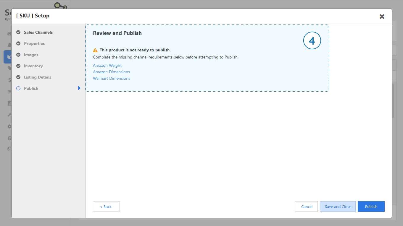
Structured Navigation: The main pages could be sections of the wizard, with tabs within these sections distinguishing between required and optional input fields. This would clarify listing requirements and reduce publishing errors.
Improved User Experience: Guiding users could address a major cause of user frustration of not knowing how to get their products listed, especially for new users during a free trial.
I integrated the wizard component within the existing design patterns of the web app to expedite the rollout, which resembled traditional desktop software rather than modern vertically scrolling pages.

Then I created low-fi wireframes to explore the various pages we might include in the wizard.


View an early workflow - includes adding an existing Amazon product, creating a bundle, and a variation set.
I continued updating wireframe flows based on continuous internal user feedback and PM requests.
Additional Feature Requests:
Multiple Images: Enable the addition and reordering of multiple product images.
Prioritize Fulfillment: Allow users to prioritize fulfillment centers per item.
Dynamic Pricing Guide: Add a dynamic reference guide to assist users in pricing items.
Final Review: Include a product listing summary on the last step before publishing to ensure major details are correct, and provide shortcuts to complete any missing information.


Working Through Technical Dependencies
When I shared the flows with the dev team, they informed me that the order of operations wouldn’t work due to technical dependencies so I revised it.
There were technical issues and dependencies in listing each product type. For instance, variation options depended on sales channel categories, and the system couldn’t display relevant fields until a category was chosen. Additionally, the product title and SKU had to be saved to the backend before launching the wizard, with the SKU being uneditable after saving.
To better understand the listing process and dependencies, I created flowcharts for the engineering team’s feedback. This helped me craft a reusable wizard component and streamline the flow for listing single, variation, or bundle products.
Optimizing for UI & Dev Efficiencies
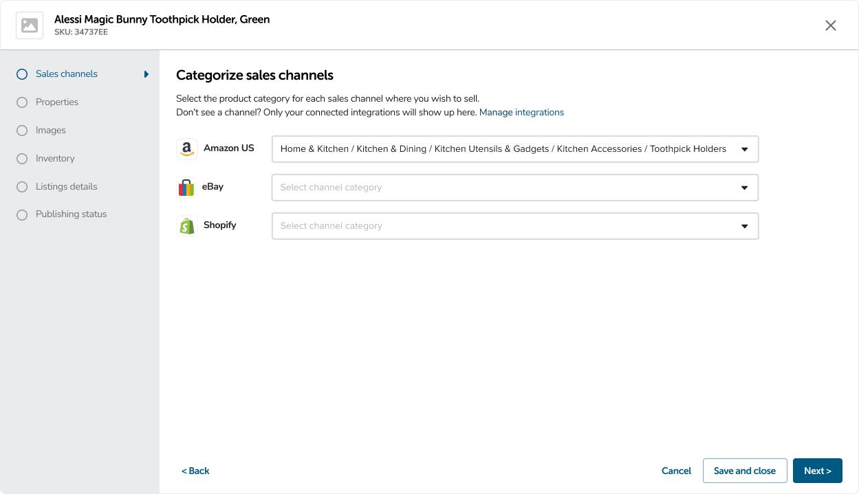
As I revised the flow, I aimed to reuse the designs during the editing process, which prompted me to incorporate the sales channels selection directly within the wizard, creating a seamless user experience and saving development time.

Incorporating User Feedback
Customers were excited about the new designs and provided additional suggestions.
To avoid delaying the release, the project manager and I discussed features that would be low effort for the dev team yet yield high rewards for the customer.
Key Features I Incorporated:
Category Shortcuts: Allowed users to quickly categorize by selecting from their most used since users often list products in the same category.
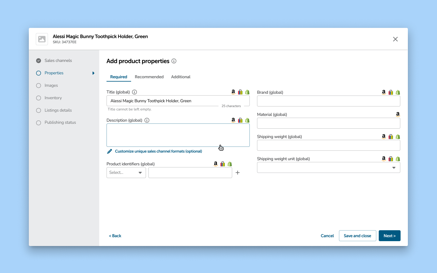
Recommended Fields: Broke up optional properties into recommended and additional ones to encourage users to complete content to help their products sell.
Price Field Additions: Added MAP and MSRP fields to the price page to help users accurately price products.


Pushing the Envelope
I proposed modernizing the layout, multiple times, during the project timeline, but the PM prioritized resolving other pressing customer issues and resource constraints over this change for the MVP.
One of my proposed concepts.
Where We Landed
My final designs greatly streamlined the listing process, catering to diverse user needs and scenarios.
While I created wireframe flows for listing each product type and listing method with all possible permutations, the example below represents only the manual creation of a single product listing.

New Workflow Benefits:
Skip Irrelevant Steps: Users can bypass unnecessary steps, focusing only on what's needed.
Reduce Errors: Easily complete all channel requirements, minimizing listing errors.
Streamlined Efficiency: Set global properties and listing details once, and they cascade across all channels.
Quick Customization: Channel-specific settings are easily accessible next to relevant global properties.
Transparent Pricing: An in-app guide helps users price items for profit with confidence.
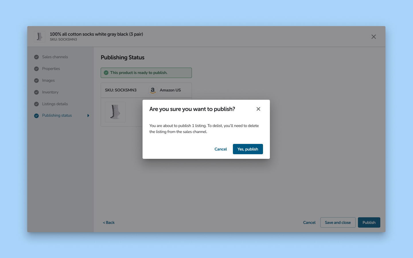
Error-Free Publishing: Preview listings before publishing to avoid mistakes.
Multi-Channel Publishing: Publish to multiple sales channels simultaneously with ease.
Time-Saving Workflow: Continuously add more products within the existing flow, saving valuable time.
The Final Impact
Customers were delighted! The intuitive design efficiently guided users through the process, accelerating workflows and reducing publishing errors.
Users could quickly and accurately publish listings across multiple channels, saving time and lightening the workload for both customers and the support team. View a video of the released design.

Products Workspace Before - hard to find how to add new products.

Products Workspace After - “Add” button highlighted and prioritized.

Add Method Before - focus on searching existing products on Amazon to resell.

Add Method After - equal emphasis on methods and improved glanceability of choices.

Product Info Before - cluttered and hard to distinguish properties, only one image allowed, sales channels & categories combined without an understanding of which properties relate to which sales channels, cognitive overload of optional properties.
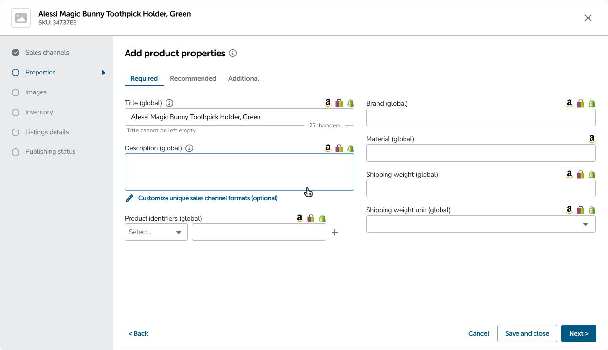

Product Info After - reordered by hierarchy and progressive disclosure since sales channels & categories determine product properties, ability to add multiple images and reorder.

Inventory Before - only one quantity field and unclear which fulfillment center the quantity belongs to.

Inventory After - ability to specify quantity and prioritize per fulfillment center and ability to create or add to bundles if needed.

Listings Before - unclear what’s required to list, no hierarchy.

Listings After - only need to enter the price once for all channels.

No Preview Before - users feel uneasy about what they are about to publish.

New Preview Page - users feel happy butterflies upon seeing a preview before publishing so they can confirm the most important details.

Wins:
Offer listing time was reduced by 90%.
Publishing errors were reduced by 80%.
A backlog of support tickets was cleared & support calls were reduced by 20%.
10+ highly anticipated features were introduced.
Losses:
Due to the delays caused by the company acquisition, the release of the new product listing wizard took longer than expected. Although we deployed some incremental changes, duplicating some coding efforts would have allowed us to roll out more updates and new features to customers more quickly.
Usability Updates:
While reviewing customer videos for usability, I noticed a findability issue for editing custom properties. I quickly created a revised design to resolve this which we deployed soon after. View a video of the updated design.
My Reflections
This project reinforced several important takeaways:
Importance of User-Centered Design: Understanding user needs and pain points was crucial. The redesign’s success stemmed from focusing on real user challenges, validating our direction and decisions.
Collaboration and Stakeholder Alignment: Working closely with stakeholders across different functions ensured that our solution was not only user-friendly, but also aligned with business goals.
Iterative Process and Flexibility: The need to adapt and iterate based on user feedback and technical constraints was a constant reminder that flexibility is essential in UX design.
Competitive Awareness: Understanding where competitors struggled allowed us to differentiate our product and offer a more effective solution.
Where to next?